Would you spend time or return to a website that takes a long time to load, doesn’t display images correctly, and is difficult to navigate? Most of us wouldn’t. Approximately 94% of people will judge your website based on its design. And if people have a negative experience visiting your website on their mobile phone, they are 62% less likely to purchase from you in the future.
Your website visitors should have a great user experience whether they are visiting your site on their desktop, laptop, tablet, or smartphone. With responsive web design your website will automatically adapt to any screen. This is a huge benefit as it will ensure that people have a good user experience no matter which device they are using. With responsive web design, the images will not be bigger than the screen is and mobile users don’t need to turn their phones or try to resize the text.
Improving your user experience will also help you to come up in relevant Google searches. 93% of online experiences begin with a web search. Instead of typing in your direct url, people will use Google to look up your business. Some people might know your name and type it in, but most people don’t know you exist and will use general keywords related to your business. When Google determines which websites to show in the search results it uses a mobile-first index, meaning it will view your site from the perspective of a mobile user instead of a desktop user.
Here’s six quick tips on how to improve your mobile user experience.
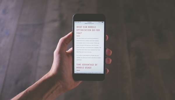
How to make your website more mobile friendly
1. Build simple navigation
Having simple navigation is one of the most important aspects of your website. You want to ensure that your website visitors find the information they are looking for quickly and effortlessly. A mobile website should feature a collapsed menu button people can click open rather than a long horizontal or vertical list of links.
2. Make sure your website is easy to read
When people visit your website on their mobile phone they scan the content quickly instead of reading the whole page. Use headers, subheaders, short paragraphs, and multimedia content to present the information in a digestible format.
3. Use bigger buttons and font
Reading and navigating a website is hard if the font and buttons are tiny. Stick to standard fonts and check that the text is big enough to read and the buttons are big enough to tap on with a finger.
4. Resize images
Nothing makes your website look more clumsy than wrong sized images. If the image is too big and doesn’t fit on the screen or so small that it’s difficult to see on a mobile screen, you have an issue.
5. Decide what elements to include on smaller screens
Less is more when it comes to mobile. Responsive design doesn’t mean that you need to replicate your website exactly as it is. Creating the best user experience might mean leaving some elements out of the mobile version.
6. Optimize your page load time
When people are visiting a website on their phone they expect quick results. Google ranks your page based on its site speed as well as the negative interactions that people have with your site. 40% of visitors will abandon your website if it takes longer than three seconds to load and 80% of those users will not return to the site.
Let us know if you have any questions about optimizing your website for mobile phones!